Voxel on Grass Textures
Voxel grabs the microphone and also talks about grass textures for a bit
Full disclosure, I am not a pixel artist or game artist, really, I’m a graphic designer, photo-real image manipulator and 3D modeller/texturer. My entire career has been based in photo-real imagery and vectors for film or advertising, so all of my illustration and cartooning experience comes from a hobbyist’s interests, but no real expertise.
I am not at all used to working in a resolution this low. The intended SNES look is giving me 128 x 192 pixels to work with. In film, you typically double the size for your working file, which means at 2x scale, my working file is 256x355. A typical working file for a shot in a film is 2160 x3840 or bigger, so you can see how these size limitations are introducing a different working style.
A lot of consideration has to go in to what is the smallest intended item in the game. If I need to render a button, or a mushroom or a blade of grass, and I only have 128 pixels to work with, I can’t spend a lot of time or pixels on details that you won’t be able to see or render them so big that they are wildly out of proportion with the other environment assets.
So I tried to visualize a scale system that basically stipulated no inventory or interactable object be smaller than a half-groovelet.
This will make some obects, like crops, cartoonishly large, but I think as long as we know we’re working with “cartoonishly large pixel art” as the parameters, we can anticipate that in the styling.
I know it’s important to have a clear brief, and I also know that getting a clear brief out of a client is almost always near impossible. There’s this thing in art where some imperious money’d overlord comes to you and says “Make me an ART!”
And you say, “Sure, what kind of art would you like?”
And they go " Isn’t that YOUR job to figure out? That’s why I told you to make me an ART, because I can’t make the art." (edit: making software is like this too - c)
You spend several conversations, days or drafts trying to extract what they actually want. It does not matter the context of the project (tattooing, branding, advertising, VFX) this process is always has been pretty key - and if you can hammer down the tone and style earlier with clarifying conversations, it really helps things go smoothly later.
Cube Drone is not an imperious money’d overlord (edit: you can’t know that for sure - c), and they have enough of a toehold in the creative and artistic spectrum, that conversations about style and intention are pretty good. I did the standard job of digging through stock sites and other artist’s portfolios to present a shwack of images that were jiving with my interpretation of the type of environment they wanted (that I wanted to sway them towards):
I like a lot of what’s going here. And the points of the brief that I though were most important were:
retro-future overgrown mutant forest (pacific NW with a touch of rainforest/jungle)
things pulse with light or glow to the music (alpha layers will be needed for this effect in-engine)
the world should animate to gently bop to the music. (think Crypt of the Necrodancer)
things are sentient. (This is all me, but I want to stick eyeballs, teeth, bug wings, horns or tails on all sort of inanimate objects in this world.)
things start off covered in trash or overgrown, and eventually become clean.
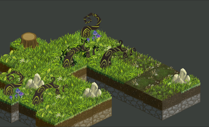
I laughed a little, because he had the dreaded “what’s the palette?” conversation with me, which is always difficult to answer this early on. I’m trying to stick to swampy greens and blues, but for now, we are trying to get minimum-viable-grass up and running, and there will be an eternity to fiddle with the greens or the dirt colours once those things are established. So in the end, I made 5 grass tiles, 2 roots, and a rock.
This is more an accurate look at them all together to scale:
You can see a failed stump, in this image, where I started it and then realized it didn’t fit with our aesthetic at all. Who cut down this tree? Why is there a pristine stump in an overgrown forest?
And there were some failed attempts at wrapping a vine around the roots. It looked OK in the PhotoShop file, but once it was halved, I felt like it confused the silhouette too much and made it hard to read.
First try:
Second Try (better, but still not working):
Also, the transition to barren dirt is only so good here:
We talked about how transitional border pieces would make that look better, but just like adding a foreground to each tile doubles the amount of exports needed per tile, anyone who’s played Animal Crossing can tell you how tedious the layout of a tiled design can be once you have to start arranging stuff like this:
It’s totally doable and will make the game look better… it’ll also exponentially increase the amount of work. I don’t think I’m “hmph’ing” or “looking at them like they’re speaking French” as much as my partner’s editorializing might imply. (edit: don’t believe Voxel, they can’t be trusted - c) I would, though, be satisfied at the start here, with getting a grass-growing simulator up and running before tackling some of the bigger aspects of the game design. Little manageable, bite-size tasks, otherwise I can see this getting hard for me to keep track of. This method, of creating tiles instead of shots, generates an enormous amount of files, and I’ll have to develop some way of versioning and tracking tile sets as we make more and more.


